Case Studies
STRATEGIC VISIONING WORKSHOP, Women’s Healthcare
Designed and facilitated a design thinking workshop to define the strategic direction of a Women’s Health department at a large hospital system. I designed the exercises, materials and led the group through a series of exercises to define a strategic vision and related strategies and bodies of work. Utilized stakeholder mapping, empathy interviews, SWOT analysis, table exercises, word association and collaborative work sessions to develop strategic direction statement (Vision) and cascading strategies and metrics. The retreat took place over two days with 50 attendees, with >70 key stakeholders involved.
WAYFINDING SYSTEM / Performing Arts Center
The Brief
The Wharton Center brings theater, music, and dance acts from around the world into the mid-Michigan region. The Center needed a wayfinding solution for guests while undergoing a major expansion project to allow for business-as-usual while large construction walls and barriers were blocking normal traffic patterns inside the space.
The Process
Using the Wharton's large hanging murals as inspiration, a system of shapes and colors run through processing software to take a "grid" of randomly generated forms and break them apart as the design moves along each wall.
The Solution
The design was installed in the space and left up for a full season, allowing patrons to find their way through the construction site in an interesting and unexpected way. The solution won Gold at the Local 2009 ADDY Awards in the student category.
BRANDING / Michigan State University Department of Art
The Brief
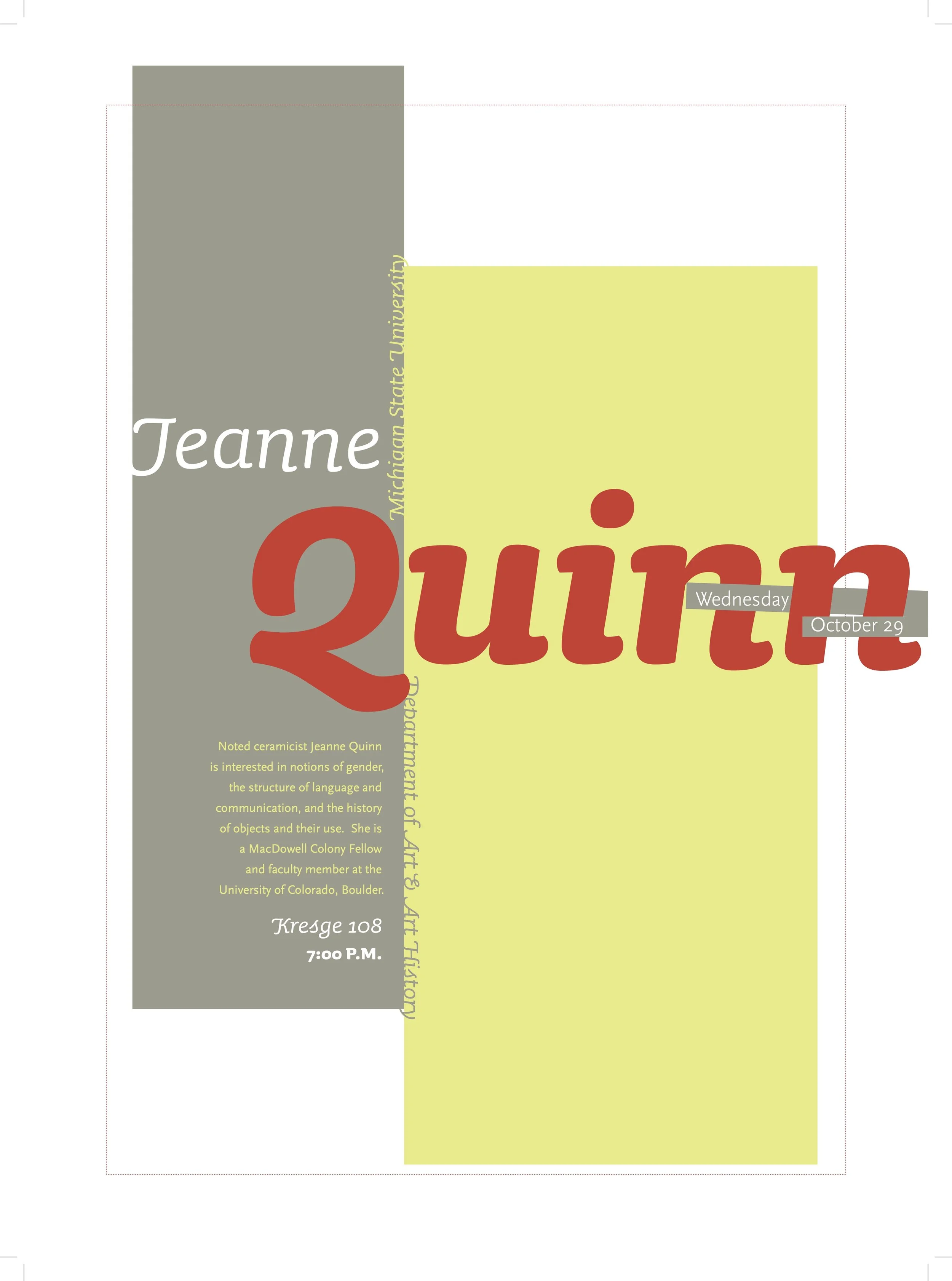
The Department of Art, Art History and Design had recently developed a basic visual system, but collateral and communications pieces were outdated. The Department hosted various guest lectures, visiting artists and annual exhibits, all in need of common branding.
The Process
Since the visual identity was still very new, I focused on type and color, following the brand standards while finding opportunities for unique and unexpected messages. Knowing the audience was largely designers, I used form (Color & Type) as the primary focal point, allowing for interpretation of each piece.
The Solution
The finished visual system worked well together, but also stood separately when necessary, as in the individual lecture posters. A series of posters were used to communicate visiting artists throughout the year and were displayed across the Greater Lansing region. A booklet and supporting collateral for the annual MFA Exhibition showcased capstone work from Masters students. The Department's visual identity became more recognized and distinct across the University.
BRANDING / Economic Development Organization
The Brief
The Lansing Economic Area Partnership (LEAP) leadership needed to communicate the organization's mission and gain membership through a series of conferences and events which needed branded materials.
The Process
The logo's overlapping circles meet at a single point, the Mid-Michigan region, the focus of economic development for the project. The overlapping elements of the logo, along with the bold vision and mission, allowed for a bold color palette, typography and photography. I worked with a photographer to choose brand images to be used in all future collateral. My role as art director meant I was collaborating with design, copywriting, production, photographers.
The Solution
Mission-centered collateral pieces were developed to educate business owners about the benefits of membership and the importance of placemaking. Bold, vibrant photography, color, and type communicated the energy of the organization’s mission.
See more at gudmarketing.com. Produced while on staff as an art director at Gud Marketing, formerly Pace&Partners.
INFORMATION DESIGN EXHIBIT / Undergraduate Thesis
The Brief
As a capstone project for my BFA, we were asked to develop an information design experience on the topic of our choice. Nutrition--and specifically Malnutrition--is a topic which is misunderstood, especially as it is compared among different cultures.
The Process
As a five-person team, we researched, designed, produced and installed an exhibition on the topic of malnutrition around the world. The system centers around the repeating square element, as reflected in the project logo’s nod to the periodic table of elements. The system of type, color, and format creates an informational hierarchy to help educate the public on the impact of nutrition on world public health.
The Solution
Elements of the show include: Wall installation explaining basic nutritional information (Prints mounted on board), Floor installation representing nutrition in different areas of the world (Prints mounted into cubes), a short typographic film explaining the show's call-to-action, and promotional invitations and posters.
Guests were invited to interact with the space in various ways, through viewing a film and writing comments on a board; Through calculating your BMI and comparing to statistics from around the world; And "traveling" around the world, with a cluster of three-dimensional informational pieces arranged by region of the globe and reflecting that area's unique nutritional strengths and concerns.
The show was installed for one night at a local gallery and received very positive feedback, including a Student Gold and Student Best of Show Addy at the local Addy award show.


